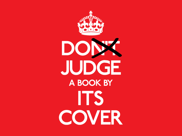
 There is an old saying that you can’t judge a book by its cover. Publishers think differently: You might not judge a book by its cover, but you sure sell a book by its cover. And yes 75% of readers use the cover as a deciding factor when they consider purchasing a publication.
The cover is a publisher’s all-important marketing tool; its purpose is to attract the reader with ‘come buy me’ seduction. Whether it is a book, magazine or brochure the cover is the advertisement for the publication and its key selling point.
If your magazine or book is sitting on a shelf or retail site competing with similar titles, then it needs to be exceptional. Your cover must be distinctive, a head turner. It has to tell an awesome story, or at least sell the promise of one!
Because the cover is so important to the success of a publication, the designer needs to work closely with the editorial, sales and marketing departments. Much needs to be discussed! Reader demographic, where and how the publication will be sold or given away and what the publication really is.
There are different design principles for designing covers depending on the type of publication. Magazine covers include key elements such as cover lines that help sell the magazine to the reader. The idea is to hook the reader with the cover lines and draw them into the content. Book covers take on a more subtle approach often with a cleaner look and simply the title and author’s name. No matter what type of publication however, the most important thing is that the cover must absolutely make a connection with the target market.
WHAT MAKES A GREAT COVER
Tell a story
A well-designed cover will tell the story of what the reader can expect to find inside. It needs to engage the reader on an emotional level and convince them to buy.
Look at the past
Before designing a cover, study some of the best ever book or magazine covers. Look at covers that have won design awards or have stood the test of time. Use these as inspiration for your own cover.
Be a risk taker
Take a risk with design and think outside the square. But remember, there is a fine line between taking a risk and creating a disaster so make sure your risk is carefully calculated!
The “wow” factor
The cover needs to make an impact. It has to have the wow factor! Use anything that will make an impression.
Keep it simple
A cover should always have a focal point. If possible use one strong image with a plain or simple background. Busy complicated backgrounds, lots of people, or intricate images will confuse the reader.
Colour
Use colours that make people feel good and suit the demographic. Red is the most popular colour for covers and don’t ask why, but there is an unwritten law in publishing that green covers don’t sell!
Get feedback
When you have designed a cover, do some market research. Show the cover to a focus group made up of a suitable demographic for their opinions and choice of cover design.
WHAT TO AVOID WHEN DESIGNING A COVER
Too much clutter
Don’t plaster the cover with too much text or too many images. One really great image is far more effective and a few good cover lines.
Don’t mislead the reader
Misleading information on the cover or Photoshop editing an image or person to the point that it is unrecognisable is both unappealing and will disappoint the reader.
Boring doesn’t sell
Safe covers with monochrome images and unimaginative titles or cover lines just don’t work. They are unexciting to the reader or potential buyer.
Tracy Marsh has published over three million books and magazines for the Australian and international publishing industry. Previously working out of Sydney and San Francisco, Tracy now operates her business in Adelaide publishing educational publications. She will be conducting a full day Publishing workshop at SA Writers Centre soon.